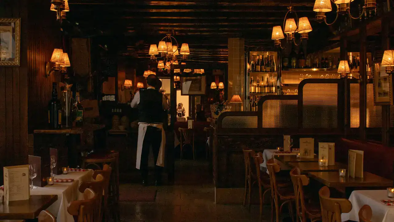
Restaurant
Restaurant Web Design Services for the Guest Deciding on Their Phone
A guest deciding where to eat is usually nearby, on a phone, and minutes from choosing. Restaurant web design builds the site around that moment: the menu readable in seconds, hours and location impossible to miss, the reservation or ordering step one obvious move away, and the character of the place intact, because the answer has to feel like somewhere worth going.
The guest is not browsing. The guest is deciding.
Most business websites are considered at leisure. A restaurant website is consulted in the gap between hungry and seated. The guest arrives holding almost everything except the answer: a location, a time, an occasion, two or three candidate places, and a set of questions the site either answers immediately or forfeits. What kind of place is this? What is on the menu, and at what prices? Where is it? Is it open tonight? Can I book a table or start an order?
The failures share one shape: the answer exists, but not where the deciding guest can reach it. The menu is a PDF that fights the phone it is read on. The hours hide in a footer. The reservation step is a number to call, unmentioned. And a template layout makes a distinctive room look like every other listing on the shortlist. The guest does not report any of this; they simply choose the place that answered first.
Restaurant web design is the discipline of building for that compressed decision: the fastest honest route from question to answer to action, with the character of the place carried the whole way, and nothing about it promises covers, orders or volume. What it changes is whether the site answers the guest who was already deciding.
Three pressures walk in with every guest.
A restaurant site fails differently, because its visitor arrives under different pressure. Read what the vertical brings, what that pressure breaks, and the work each failure calls for.
The Industry Pressures
The Nearby Decision
The guest is close, on a phone, holding two or three options, and the choice lands in minutes, not meetings.
The Menu Is the Product
What is served, at what price, for which diets: the offering itself is the information the guest came for.
The Occasion Test
Date night, quick lunch, a table for twelve: the guest is matching a room to a moment, sight unseen.
What Breaks
The answers hide
The menu is a PDF, the hours live in a footer, the address is behind a tap, and every buried answer sends the guest to whoever answered first.
The action has no path
The guest has decided, and the site offers no obvious way to book the table or start the order. The decision expires where the path should have been.
The room goes flat
A template layout makes a distinctive place look interchangeable, so the occasion test fails before a single dish is read.
What Answers It
Website Design & Development
The anchor discipline: information architecture built for the deciding guest: menu, hours, location and the next action, in that order, on a phone.
View Website Design & DevelopmentSearch Engine Optimization
The guest decides nearby, so local visibility is part of this vertical's context, handled in depth by the specialist service when search itself is the constraint.
View Search Engine OptimizationBranding Design
Atmosphere is carried by identity. Where the identity itself cannot say what the room is, that is its own engagement: settled there, expressed here.
View Branding Design
An order of operations, not a promise: the context decides what breaks, and what breaks decides which work matters first.
Five jobs, before any flourish.
A menu that reads like a page, not a download
Legible on a phone, current without a designer, and structured the way guests actually choose (by course, by craving, by dietary line), with prices where the eyes expect them.
Hours, location and contact at a glance
The operational answers are the site's most-asked questions. They live where nobody has to hunt: not buried in a footer, not behind a tap, never out of date.
A next action that fits the operating model
A tasting room books tables; a counter shop takes orders; some rooms just need the phone to ring. The site gives the model it serves one clear, prominent path rather than bolting on every button.
An action hierarchy built for the phone
The deciding guest is on a mobile screen, often standing up. Menu, hours, directions and the booking step are ordered for thumbs and urgency, not for a desktop mock-up.
Atmosphere the design actually carries
The site is the first look at the room. Type, colour, photography and pacing should read the way the place feels, because the occasion test is decided before anyone walks in.
Three services, each earned by the context.
The build anchors the engagement. Local visibility and identity enter because this vertical's constraint reaches them, not because the catalogue exists.
Website Design & Development
Strategy, design and engineering built as one commercial instrument.
View Website Design & DevelopmentSearch Engine Optimization
Organic visibility earned through structure, content and technical work.
View Search Engine OptimizationBranding Design
The full identity system, not just the mark that sits on top of it.
View Branding Design
Before you ask.
Before rebuilding the restaurant's site,
find where the guest gives up.
We start by reading where guests actually give up: before the visit, on the menu, at the booking step, or somewhere upstream of the site entirely. If the site is the constraint, this is where the work starts.