People Over Transactions
We made the logo the argument.
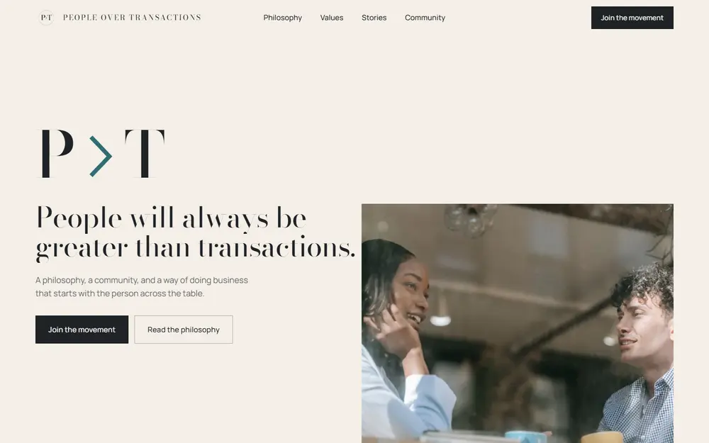
People Over Transactions is a lifestyle and philosophy brand built on one belief: people are more valuable than transactions. The client supplied the logo, a high-contrast serif P and T joined by a teal arrow. This concept homepage was built from that logo. The member stories are unnamed placeholder archetypes, written to be replaced with real ones.
Values brands usually state their values and stop, and a list of nice words is easy to scroll past. The site had to make a visitor feel the idea rather than read it, and then invite them to join.
Scroll through the site

Not a task list.
A set of deliberate moves.
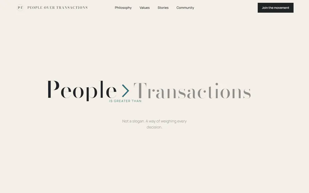
The symbol unfolds
P > T expands into People > Transactions as you scroll, then Transactions fades back while People grows. The logo becomes the argument.
Four values, four screens
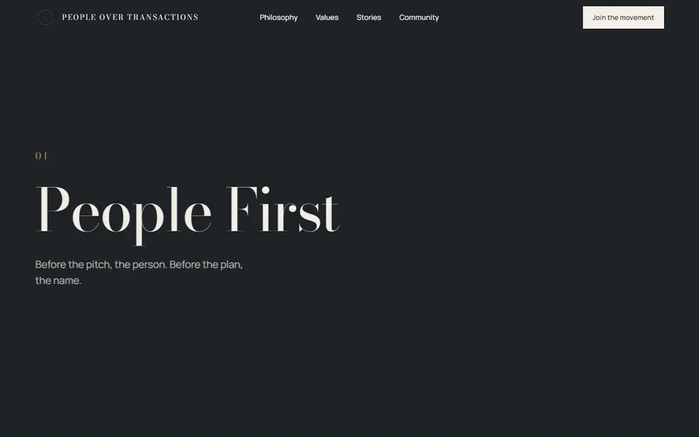
Each value gets a full charcoal screen of its own, stacking over the last: People First, Trust Before Profit, Relationships Over Revenue, Impact Over Numbers.
Type that matches the mark
Bodoni Moda was chosen because it matches the logo's high-contrast serif P and T, with Manrope for reading. An ivory ground, one teal accent and sharp corners.
The result, in plain terms.
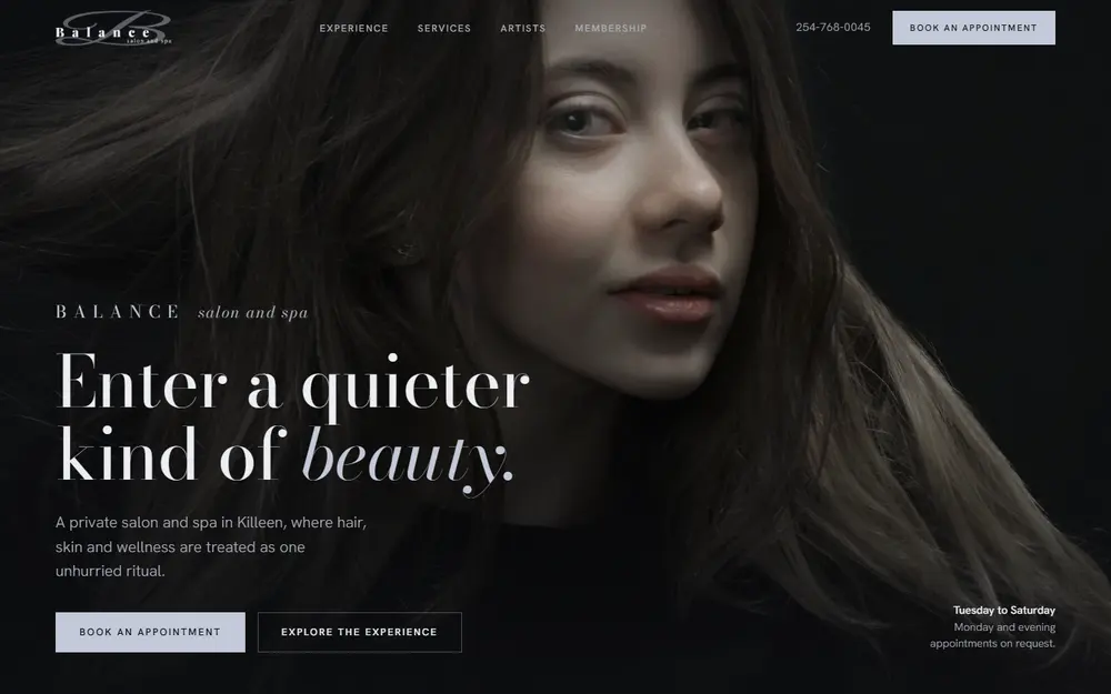
This level of thought,
on your brand.
Every project starts the same way: with a diagnosis of what's actually holding you back. Get yours.