Route 66 Smashburgers
We turned a logo into a road trip.
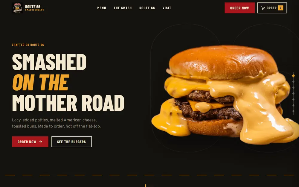
Route 66 Smashburgers came to us with one asset: their logo, a Route 66 shield with slanted SMASHBURGERS lettering in vintage cream, Route 66 red and golden orange. We built this concept site from that logo alone, to show the owners what their brand could become online. Menu items, prices and the address are sample content, marked as such inside the build.
Burger-joint websites tend to look the same: a stock photo, a PDF menu, and an Order button that sends people off to a delivery app. The logo pointed somewhere better, the American road. The job was to turn that into a site with a place, a voice and a way to order, without sliding into a retro template.
Scroll through the site

Not a task list.
A set of deliberate moves.
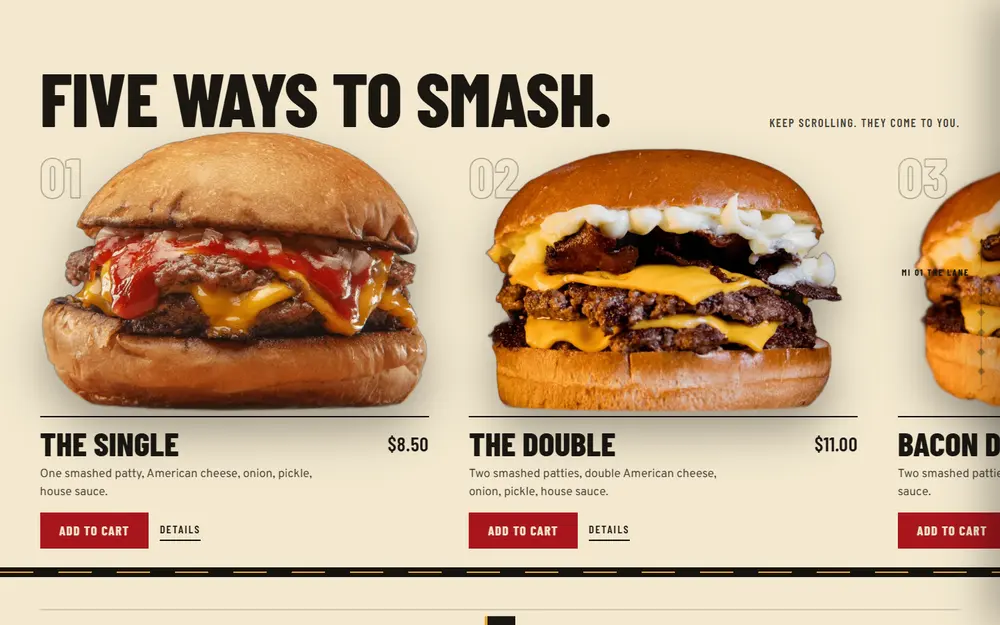
The lane
The signature burgers roll past on a dark road strip while the dashed centre line moves beneath them: a pinned drive-through on desktop and a swipe carousel on phones.
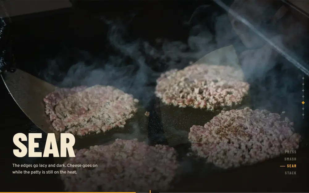
Press, sear, stack
The method told in four pinned beats, with crossfading photography and a progress line that fills like a road.
Type from the highway
Barlow Condensed and Overpass both descend from US highway lettering, so the type itself belongs to Route 66. Sharp corners everywhere and one red for every action.
The result, in plain terms.
This level of thought,
on your brand.
Every project starts the same way: with a diagnosis of what's actually holding you back. Get yours.